
Some folks from my local writers’ group have asked me about some of my print formatting decisions, so I thought I would write up a few posts about it. I realize that most of my sales are e-book, but I wanted to have some nice-looking print editions. If nothing else, they look good on my bookshelf.
I should also point you towards The Book Designer, which is where I learned most of what I know about print formatting. He also made several MS Word templates for formatting a print novel, available at Book Design Templates. I have heard good things about them, but I’m something of a DIY guy for this kind of thing.
So today I’m talking about page size and margins. I’ll put a summary of the numbers at the bottom, but first I’d like to say a little about how I chose them.
First of all, I print my books at 5.5 x 8.5 inches, and right off the bat, I’ll tell you it’s a compromise. I started off wanting to do the tight little mass-market paperback size of 4.125 x 6.75 inches, but I couldn’t. For starters, that size was not offered by my printer, and even if it was, it would be problematic. I would either have to shrink the margins and font quite a bit or have it be so thick as to be unrealistically expensive. Print-on-Demand charges per page, not per square inch of paper, so a 200 page book at 5 x 8 is about twice as expensive as a 100 page book at 8 x 10, even though they have the same amount of actual paper. So, bigger is cheaper. But is it better?
I went through my library and grabbed a dozen trade paperbacks of various sizes and thicknesses. I recommend you do the same if you can. Handle them. Flip through them. Hold them open with one hand, particularly at odd angles like you might in bed or flopped down in a recliner. Of all of those, the 5 x 8 felt the best in my hand. Anything 6 x 9 and up flopped around too much – the paper and cover wasn’t stiff enough to hold itself up across such a distance.
But once I started playing with fonts and margins, the 5 x 8 page-size simply required too many pages for the 80,000-100,000-word novels I intended to write. So, I compromised at 5.5 x 8.5. My sample books of that size held up fairly well, so that’s what I went with. I squeezed my margins just a tad (but far less than I’ve seen elsewhere), and that got the price down to the right range. It also made for a nice aspect ratio for the cover image:
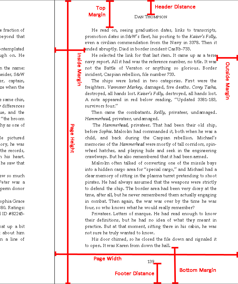
 As for the margins, it would nice to say something simple like, “Yeah, three-quarters of an inch all the way around.” Alas, it’s not quite so simple. Let’s take a look at a sample page from Ships of My Fathers.
 (click to see at full resolution)
There are four main margins and two more annotational distances. The top margin and bottom margin are fairly self-explanatory, but do note that these are the distance from the edge of the page to the main body of text, not the distance to header or footer. I chose 0.8 inches for both of these margins. I have seen a number of other folks recommend anywhere from 0.5 to 0.75 inches for that, but when I held various books in my hand, I found that my thumbs or fingers tended to push up through those shorter distances. So, if my print books seem to have more white space than the norm, blame my big hands.
The side margins are a little trickier because of their asymmetry. Note that this sample page includes a bit of the facing page to put it into context. Also adding to the confusion, there are two ways to specify them. I usually deal with them as “inside margin” and “outside margin”. The other way to go is to specify right and left margins and then add in a special “gutter” margin that will be added to the right margin on lefthand pages and to the left margin on righthand pages. I found it simpler to fold it in and deal explicitly with inside and outside margins.
I set my outside margin to 0.65 inches. My big thumbs would have preferred something closer to an inch, but that pushed the page count up too much. Besides, given how many books I saw with half-inch margins, I figured I was being fairly generous here.
I set my inside margin to 0.9 inches. In terms of the gutter, that’s adding a quarter of an inch. How much you add here depends a lot on how thick the book is. Hardcover books that stitch their pages to the spine have more flexibility here, but with a glued or “perfect” binding, thicker books don’t open as wide. Here it was not just how far I could jam my thick thumb into the page-fold, it was a matter of reading the text that was curving into the spine of the book. It doesn’t become illegible, but I found it to be annoying if it went in too far. How far was too far? Again, it’s a matter of personal taste, but after looking at several other books in the 300-page neighborhood, I found the comfort zone between 0.8 and a full inch.
(A note on measuring the inside margin on sample books: do not try to jam a ruler in there. You won’t get an accurate measurement. Measure the cover width and measure the distance from the inside-most text to the outside of the page. That difference will give you the proper inside margin measurement.)
Finally, the header and footer. I could have gotten by with just a header, putting my page numbers up top in the corners, but I liked the look of them at the bottom. It was also the more common location in trade paperbacks. (Mass-market paperbacks tend to use the corners.) For these, I pushed them 0.4 inches from the top and bottom of the page. Note however, if you avoid the footer, don’t think you can skimp on the bottom margin. It’s fine if the readers’ hands and fingers obscure the footer, but not the bottom line of the text.
So, to wrap up:
Page size: 5.5 x 8.5 inches
Top/bottom margins: 0.8 inches
Inside margin: 0.9 inches
Outside margin: 0.65 inches
Header/footer distance: 0.4 inches from edge
Next time I’ll talk about font choice and size as well as some of the other paragraph-level formatting choces.